The new logo of the Winnipeg Jets, inspired by the RCAF Roundel!
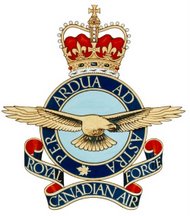
This has the feeling of providence. True North Sports & Entertainment unveiled today the primary and secondary logos for the Winnipeg Jets Hockey Club which will begin play in the National Hockey League in 2011. The design for the new logo, which was developed in partnership with Reebok and the NHL, was inspired by the roundel of the Royal Canadian Air Force.
WINNIPEG — The Winnipeg Jets have opted for a sleek fighter jet as the centrepiece of their new logo.
The design has the jet pointed north over a red Maple Leaf in a blue and grey circle.
The Jets say the new logo, developed in partnership with Reebok and the NHL, was inspired by the logo of the Royal Canadian Air Force.
The franchise confirmed at last month's NHL draft that it would be using the Jets nickname.
But the team did not show its hand on the logo, giving top draft pick Mark Scheifele of the Barrie Colts a generic NHL jersey.
The team played as the Atlanta Thrashers last season before it was purchased by True North Sports & Entertainment.














Seems like its nearing the end for bringing the true service names of Canada's military back.
ReplyDeleteI really like the design gives a sense of pride and power.
ReplyDeleteWouldn't the Gold Medal Winning 1948 RCAF Flyers take some pride in this?! Although that team was based in Ottawa, there has always been a strong link of Winnipeg to the RCAF.
ReplyDeleteAbsolutely delighted that they had the cooperation of the ‘Canadian Forces and DND’. This is very good news
ReplyDeleteLooks great! Interesting that True North did not say the new logo was inspired by "Air Command" or even the "Canadian Air Force". The return of the "RCAF" is coming!
ReplyDeleteDan
Outstanding!
ReplyDeleteThe logo should relate to a hockey team and be separate from the Military (no offence to the Military) It looks like a target? Sorry (I am a woman) and do not like the logo at all.
ReplyDeleteThe original logo should have stayed.
Looks very good, one of the best logos in the NHL.
ReplyDelete"The logo should relate to a hockey team and be separate from the Military"
ReplyDeleteThe Brampton Battalion and Windsor Spitfires will be dismayed to learn that.
As an ex-pat since the Jets left, I am so proud of the design, their return, everything... hope that huge portrait of HM The Queen returns to the arena!!!
ReplyDeleteHi there, after reading this remarkable paragraph i am as well glad to share my familiarity here with colleagues.
ReplyDeleteTake a look at my homepage ... insomnia 8th street
Also see my webpage - insomnia 563 bloor street west
Fastidious respond in return of this question with real arguments and telling the whole thing on
ReplyDeletethe topic of that.
Stop by my homepage ... calories burnt walking
I always used to read paragraph in news papers but now as I am a user of web so from now I am using net for content, thanks to web.
ReplyDeleteFeel free to surf to my web blog :: calories burned walking calculator
Link exchange is nothing else however it is just placing the other person's webpage link on your page at proper place and other person will also do same in support of you.
ReplyDeletemy web site - acoustic guitar a chord
My spouse and I stumbled over here from a different page and thought I
ReplyDeletemight as well check things out. I like what I see so now i'm following you. Look forward to looking into your web page for a second time.
Here is my page :: acoustic guitar a chord